
Taşçıoğlu Medikal
We're designing and building a product-catalog website for Taşçıoğlu Medikal and advising the brand on its Instagram presence. The project is ongoing.
This project is ongoing. The website is still in development and has not launched; the visuals on this page come from the work in progress.
- Client
- Taşçıoğlu Medikal
- Industry
- Medical products and equipment supply
- Category
- Web Design · Product Catalog · Social Media Consultancy
Overview
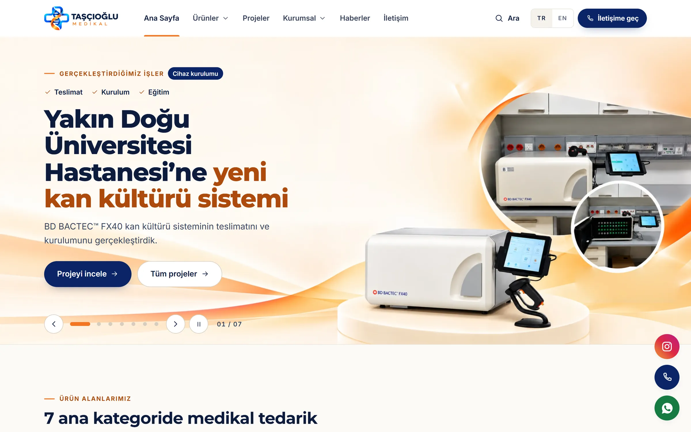
Taşçıoğlu Medikal supplies medical products and equipment to healthcare providers, laboratories, care centres, beauty and aesthetics clinics and veterinary practices. Two complementary workstreams run side by side: designing and building a product-catalog website, and social media consultancy for Instagram.
Brief and goals
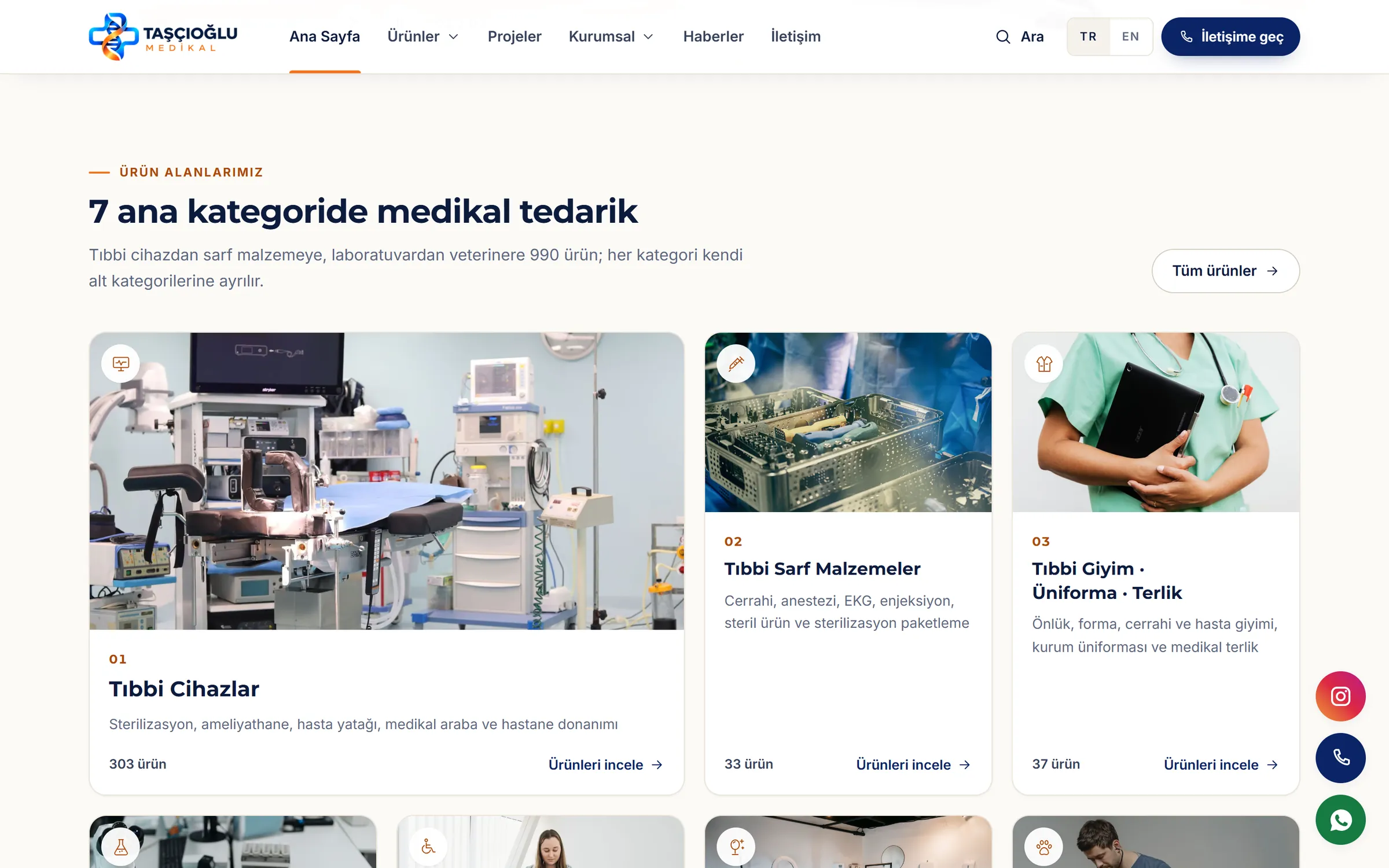
The goal is to present a wide range of products across very different areas in a structure visitors can browse without getting lost, with a direct route to an inquiry from every product page. On social media, the aim is to explain the brand's products and services clearly, in a consistent visual language.
Services and scope
Web Design & Development
- Medical product catalog and category architecture
- Product discovery and browsing
- Product presentation and information hierarchy
- Product inquiry pathways
- Responsive interface design
- Corporate brand presentation online
Social Media Consultancy
- Instagram business presence and profile presentation
- Brand-consistent content direction
- Content planning and visual consistency
- Digital communication strategy
- Content concepts that explain products and services clearly
Creative direction
Trustworthy navy, warm orange accents and open, light backgrounds, with simple cards that put the product photography first.
Design
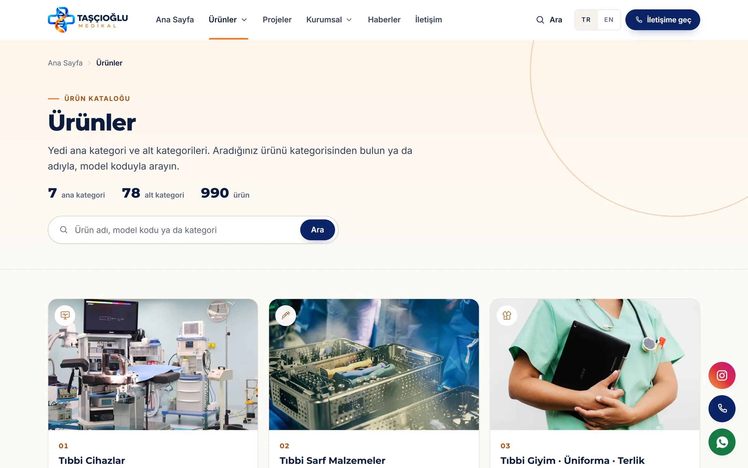
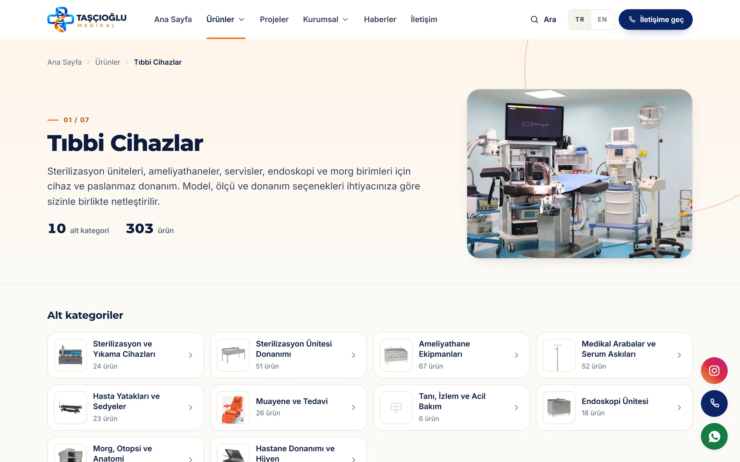
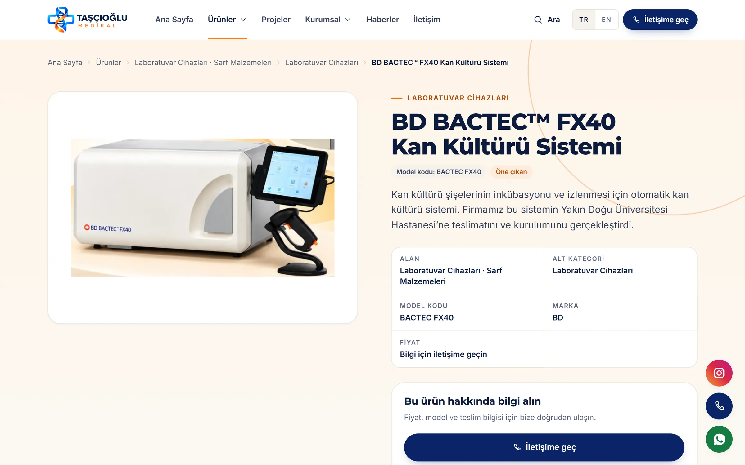
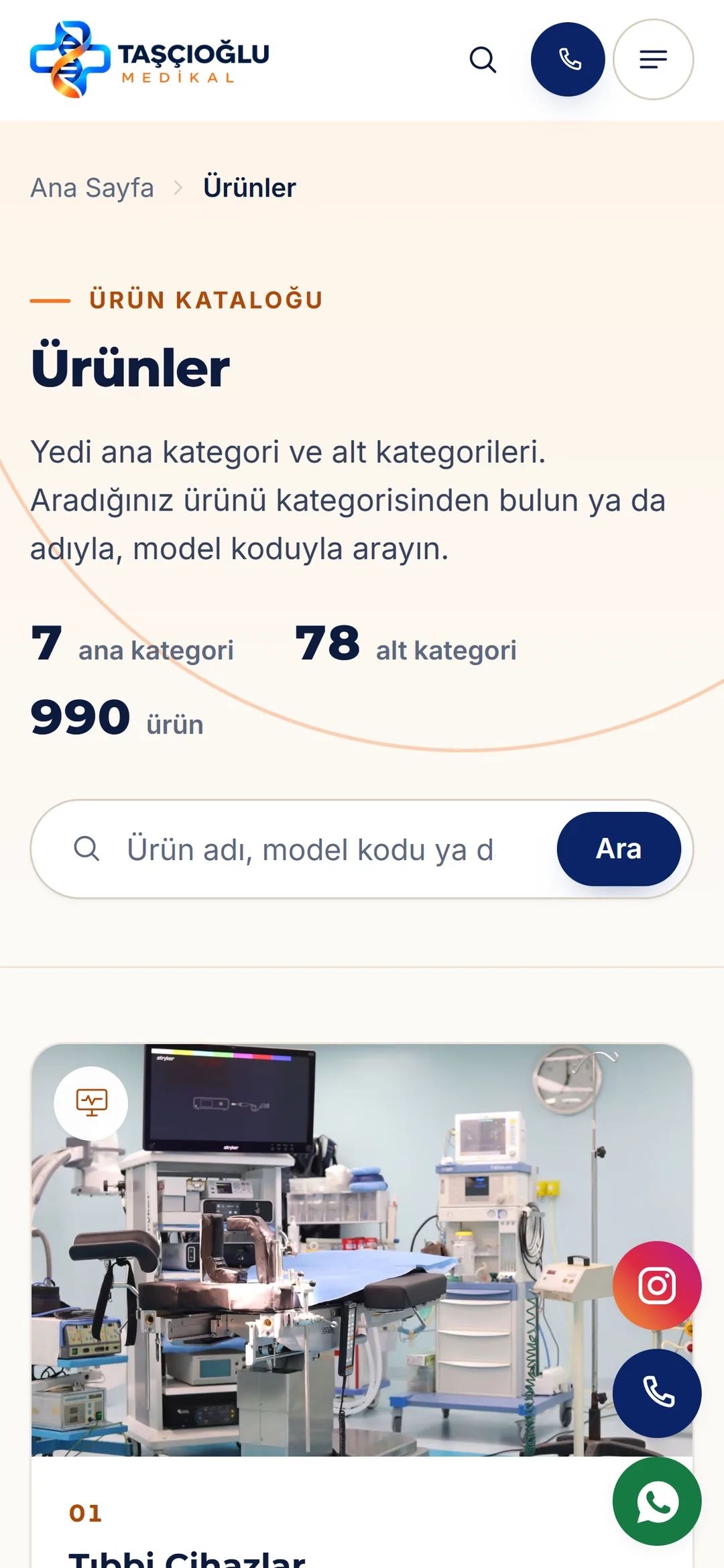
In the site under development, the catalog is built on seven product areas: medical devices, medical consumables, medical clothing, laboratory, orthopaedics and patient care, beauty and aesthetics equipment, and veterinary products. Each area divides into subcategories, and products can be searched by name, model code or category. Product pages set out the area, subcategory, model code and brand in a tidy table; instead of a price, an inquiry panel leads to phone, WhatsApp and email.
Responsive design
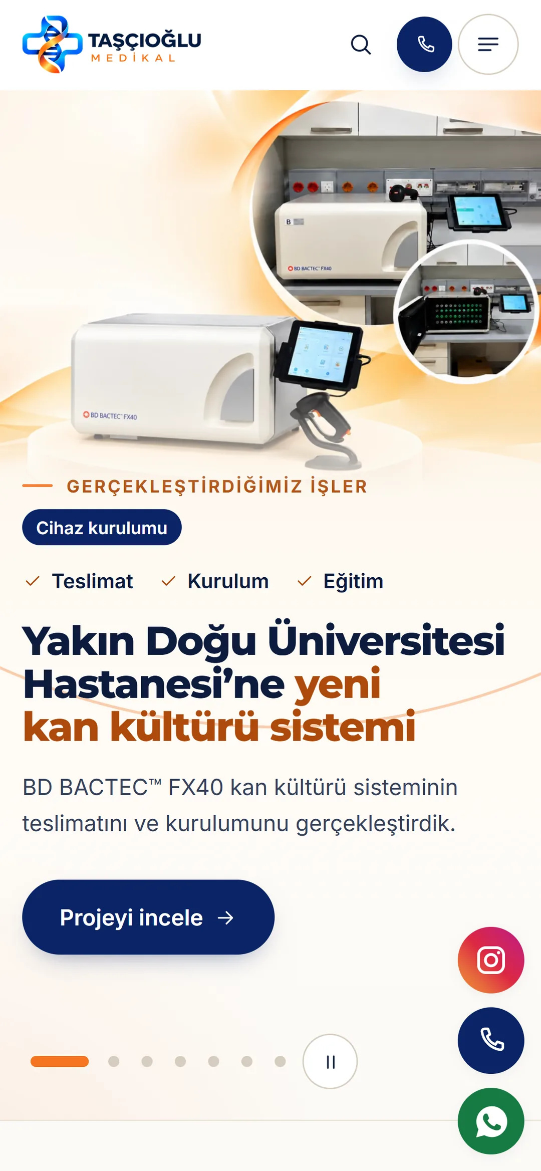
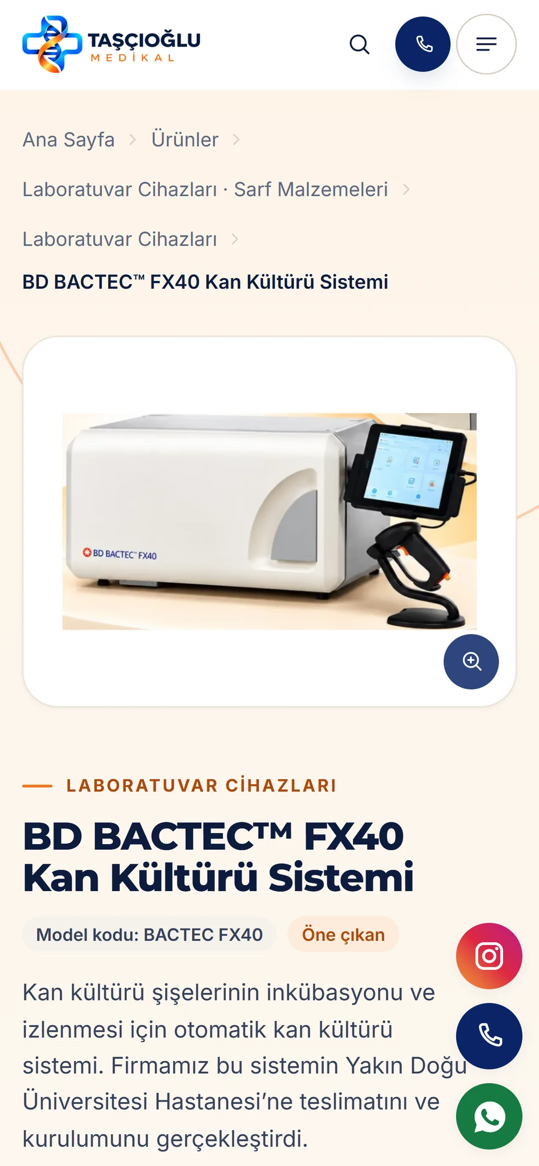
On phones, product search and a call button stay within reach in the top bar; category and product pages collapse to a single column, and Instagram, phone and WhatsApp shortcuts stay pinned to the edge of the screen.
Next project
6 ARALIK